
What Is an Org Chart? (And When Your Team Outgrows One)
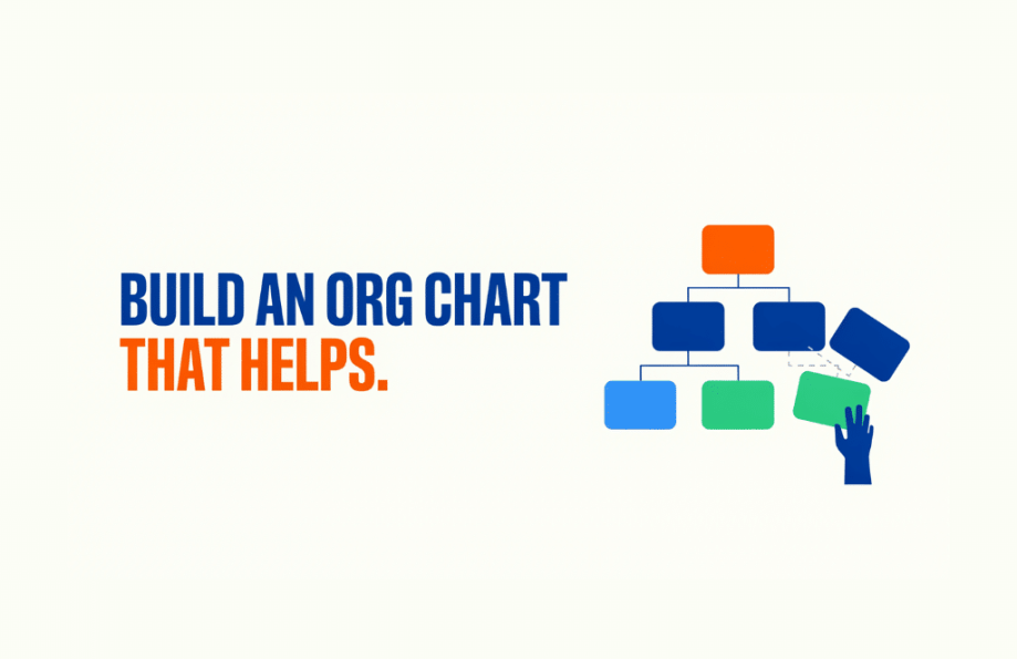
An org chart is a diagram that shows the reporting structure of an organization, mapping who reports to whom across teams and departments.
It is one of the first things a new hire gets handed and one of the first things a growing company draws. And it does a genuinely useful job: it makes the shape of an organization visible at a glance. It also has a blind spot worth understanding, which is where the second half of this guide goes.
What is an org chart?
An org chart, short for organizational chart, is a visual map of reporting relationships. Boxes represent roles or people, and the lines between them show who reports to whom. Read top to bottom, it tells you the chain of command: who leads which team, which departments sit where, and how the whole thing rolls up to the top.
Its value is clarity of structure. In a company of ten, everyone knows how things connect. At a hundred or a thousand, that knowledge stops being obvious, and a chart is the fastest way to answer “who runs that team” or “who would sign off on this.”
What are the main types of org charts?
Most org charts fall into a few shapes:
- Hierarchical. The classic top-down tree, with a clear chain of command flowing from leadership down through managers to their teams. The most common by far.
- Matrix. People report to more than one leader, often a functional manager and a project lead. Common in organizations that run cross-functional work.
- Flat. Few layers between leadership and the front line. Typical of smaller or newer companies that value speed over structure.
- Functional or divisional. Grouped by department (marketing, finance, operations) or by division (region, product line, business unit).
The right shape depends on how the organization actually operates, and most large companies are a blend rather than a pure type.
What is an org chart used for?
An org chart earns its keep in a handful of moments. It helps a new hire understand where they sit and who to go to. It clarifies reporting lines during a reorganization. It gives leadership a clean view of how the company is structured, and it settles the everyday “who owns this area” questions without a meeting.
In short, it answers structural questions well: who reports to whom, which team owns which function, how the organization is arranged.
When does a team outgrow the org chart?
Here is the blind spot. An org chart shows you the structure, but it says nothing about the work.
It tells you that eight people report to a marketing director. It does not tell you what those eight people are working on this week, which projects are on track, or whether two of them are quietly buried while a third has room to spare. The boxes and lines are fixed; the work moves every day. As a team grows and projects start crossing departments, the questions that matter most, who has capacity, what is slipping, who owns this deliverable, are exactly the ones a reporting diagram cannot answer. That is also where ownership tends to blur, which we unpack in Scope Creep, Issue 2.
That is a different kind of visibility. Structure is what an org chart shows. Work is what a project management system shows. The two answer different questions, and a growing team needs both.
This is the gap Workzone is built to close. Where an org chart maps reporting lines, Workzone maps the work across those lines: who owns each task, what every team has in flight, and a workload view that shows at a glance who is overloaded and who has room. That cross-team picture is also what a PMO relies on to keep delivery consistent, and what connects daily work back up to the strategic plan the org chart can only imply.
An org chart will always be the right tool for showing how a company is structured. It is just not the tool for running the work, and knowing the difference is what keeps a growing team from mistaking a tidy diagram for a clear view of what is actually happening.
See cross-team workload in Workzone →
Frequently asked questions
What is an org chart in simple terms?
An org chart is a diagram that shows how an organization is structured, using boxes for roles or people and lines to show who reports to whom. It lets anyone see the chain of command and how teams and departments fit together, which is especially handy for onboarding and for answering “who runs that team.”
What are the types of org charts?
The main types are hierarchical (a top-down tree), matrix (people report to more than one leader), flat (few layers), and functional or divisional (grouped by department or business unit). Most large organizations use a blend rather than a single pure type, matched to how they actually operate.
What is the difference between an org chart and an org structure?
The org structure is how an organization is actually arranged: the roles, reporting lines, and how authority and work are divided. The org chart is the diagram that pictures that structure. One is the reality; the other is the map of it.
What does an org chart not show?
An org chart shows reporting structure, but not the work. It cannot tell you what each person is working on, which projects are on track, or who is overloaded, because those change day to day while the chart stays fixed. For that, teams use a project management system that shows the work and workload across teams, not just the reporting lines.
Last updated on July 9, 2026
Want a Peak Inside Workzone?

Continue reading

Ready To See Workzone In Action?
Simple project management software with real people ready to help you get started.


