Updates to the Workzone User Interface
We’ve updated Workzone’s Task List with a lighter, more modern palette, focusing on the content that matters most, while reducing emphasis on less important items. While the changes are primarily to this one module, we’ve also updated button styles site-wide for consistency.
More generous vertical spacing in the default (“comfortable”) view makes content easier to read (and less intimidating for new and less technical users). Those preferring to see more information at once can switch to the “compact” view via a new “Display density” setting.
See the annotations below for callouts of what’s changed. Click the image or click here to see a full-size version of the screenshot.
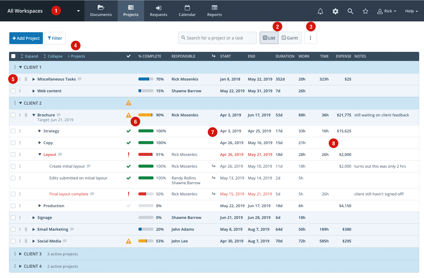
- We’ve reduced the height of the header to give more vertical space for your content on all pages. We’ve also automatically resized any workspace logos.
- We’ve moved the toggle between the List and Gantt views to the right to save space.
- There is a new page “more” menu (button with 3 vertical dots) at the top right, offering a consolidated area to access options for the Task List. This is also where the new “Display density” setting can be found (more information below).
- We’ve moved the Expand/Collapse/Projects links to the header row to save space.
- “More” menus (3 vertical dots) have been added to the far left for all rows to give easier access to additional options.
- Status and % complete columns have been moved to the left to make them more prominent and easily accessible. % complete column is now displayed by default (you can hide this under Settings-Projects-Columns to display).
- Start/End dates have been moved to the left of the Duration/Work columns to make them more prominent.
- Time (and expense) now show actual totals and are moved to the right of the work column. To save horizontal space, there is an option to collapse these to icons using the page “more” menu.
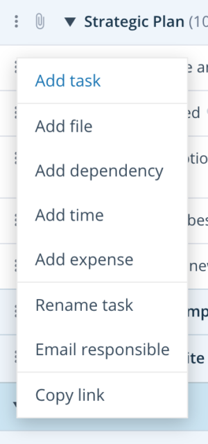
The task “more” menu now includes additional options to add time, expenses, and dependencies, giving quicker access to key features.
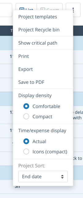
The new page-level “more” menu (3 vertical dots at the top right of the screen) provides access to features that were previously spread out throughout the interface, including project templates, print, export, critical path and project sort options. New features like “Display density” and “Time/expense display” are also located here.